1% everyday – Visual design and Gestalt principles

When talking about visual perception the most enduring explanation is the Gestalt principles.

Smashing has a good article: https://www.smashingmagazine.com/2014/03/design-principles-visual-perception-and-the-principles-of-gestalt/

Visual Principles (Gestalt):

  • Similarity: shapes, color, size
  • Continuation: paths, lines, curves, flow
  • Closure: complete shapes, perceived completeness
  • Proximity: proximity of objects create a perceived larger shape u Figure/ground: visual separation of figures from backgrounds
  • Symmetry and order: balanced and complete

Visual Principles (Gestalt) examples:

Similarity: shapes, color, size

Three blocks of arrows. The first is all the same color mostly facing downwards. There is a diagonal of right facing arrows that stand out. The middle is the same picture but the diagonal in the other direction is a darker green and they stand out. On the right a subset of the arrows on the top and right are half the width and they stand out.

Continuation: paths, lines, curves, flow
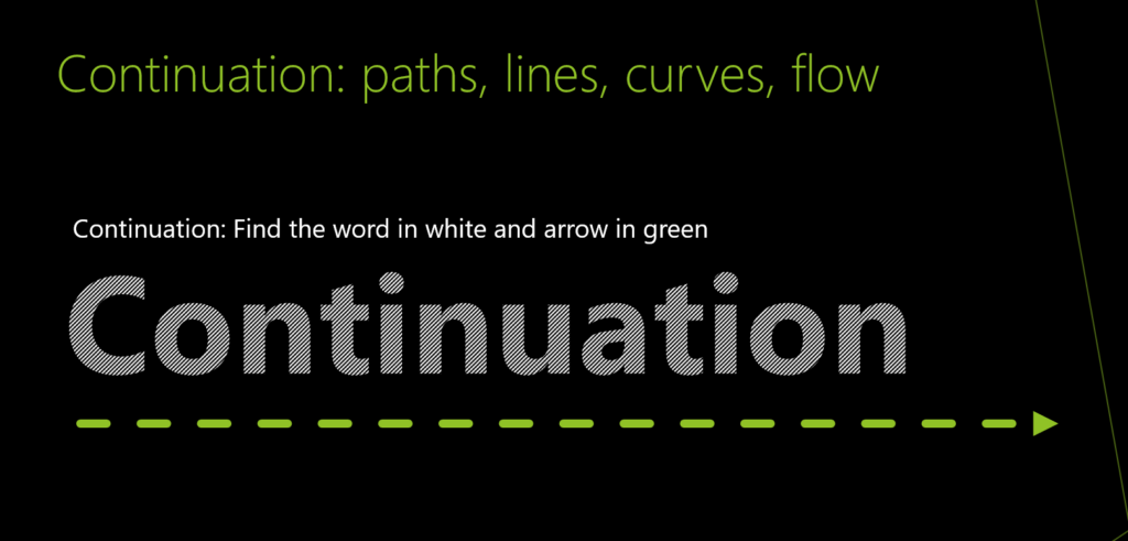
The word Continuation is written with tightly spaced parallel lines and beneath it is a series of dashes with a triangle the look like an arrow,

Closure: complete shapes, perceived completeness

To sets of dashed lines that make it look like and arrow pointing right and an arrow pointing down.

Proximity: proximity of objects create a perceived larger shape 
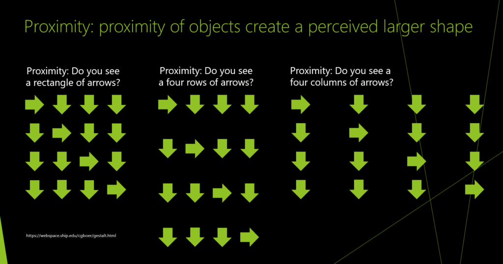
4X4 of the arrows again evenly space and it looks like a square, The middle example the arrows from left to right are tightly spaced and from top to bottom have double the space. It make it appear as though there are rows. And the third set on the right, the arrows are tightly spaced vertically and have double the space horizontally making it appear as though there are columns

Figure/ground: visual separation of figures from backgrounds
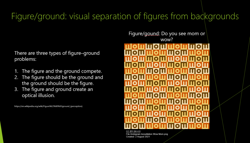
There are three types of figure–ground problems:

The figure and the ground compete.
The figure should be the ground and the ground should be the figure.
The figure and ground create an optical illusion.
The image shows colored three letter sections repeated. They are identical but in some cases the word mom jumps out and in other cases the word wow jumps out... but there are no differences besides the color.

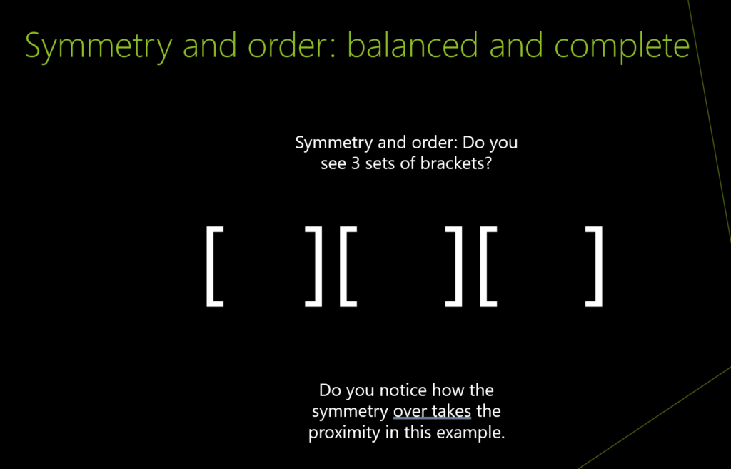
Symmetry and order: balanced and complete

There six square brackets with empty space between them. In the middle, the right closing bracket of the first set is up against the left opening bracket of the middle set. There is a big space the the right closing bracket of the middle set is up against the open bracket of the last set. This makes it look like the closing and opening brackets back to back belong together even though logically we know they do not go together.

Deeper Dive: Video explainers

  • Gestalt Principles. How psychology influences your design strategy. – by Art with Kunstler
  • Gestalt Psychology and Why It’s Essential for Good Design – by HubSpot Marketing

Deeper Dive: Further reading

Apply what you have learned to UI Design and Development following the above rules.

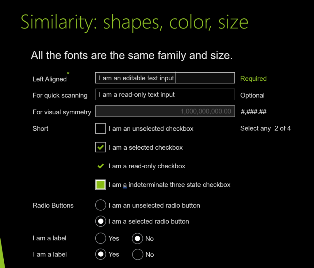
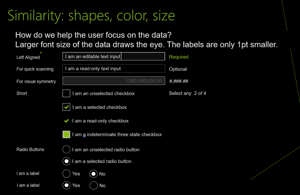
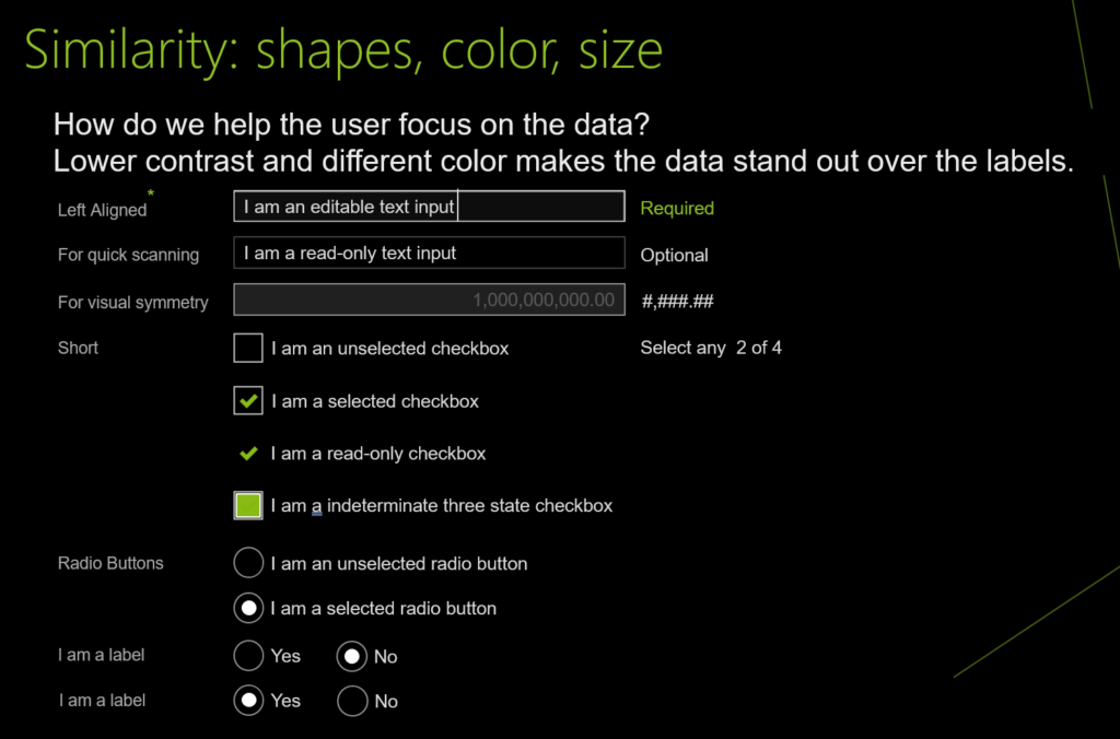
UI design and development example for Similarity: shapes, color, size

Image shows labels and iputs with the same fonts, sizes, and colors
this image shows the labels 1px smaller
This image shows the labels 1px smaller and a lower contrasting color. The result is that the input data is bigger and brighter and therefore stands out.

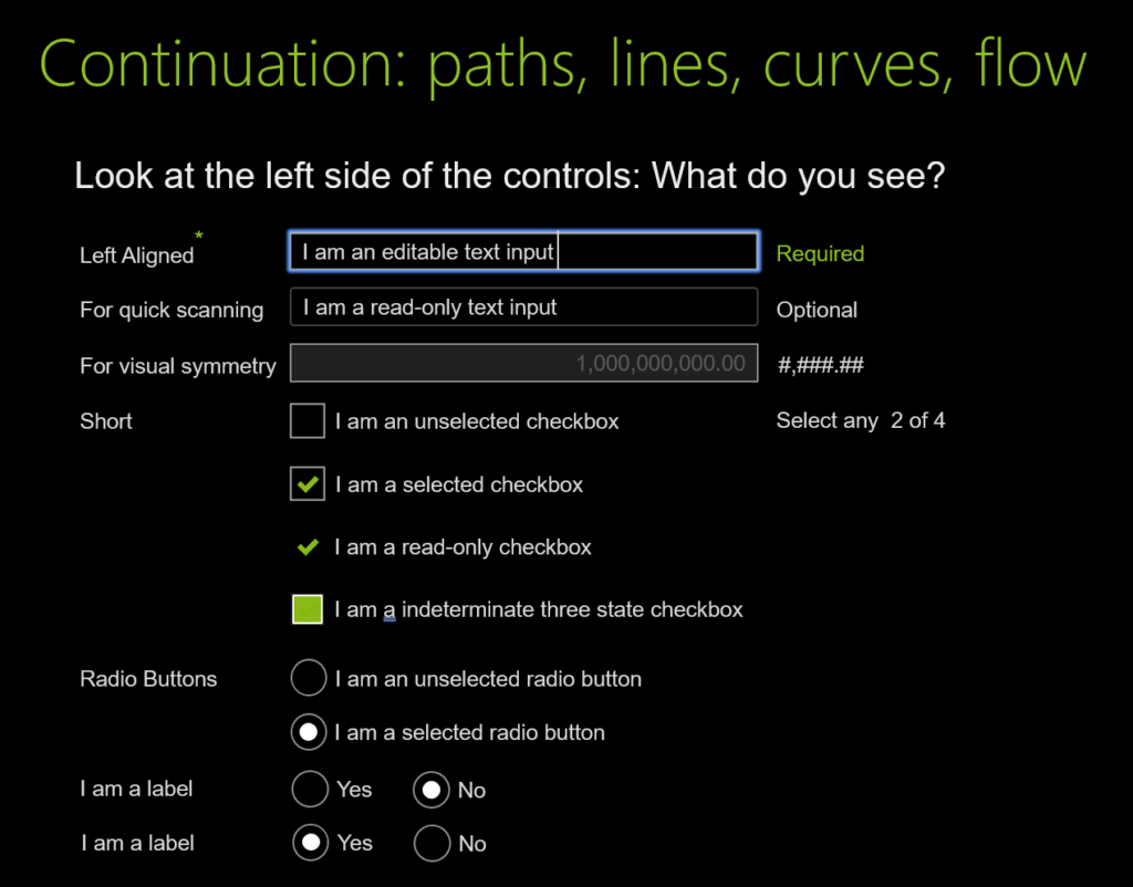
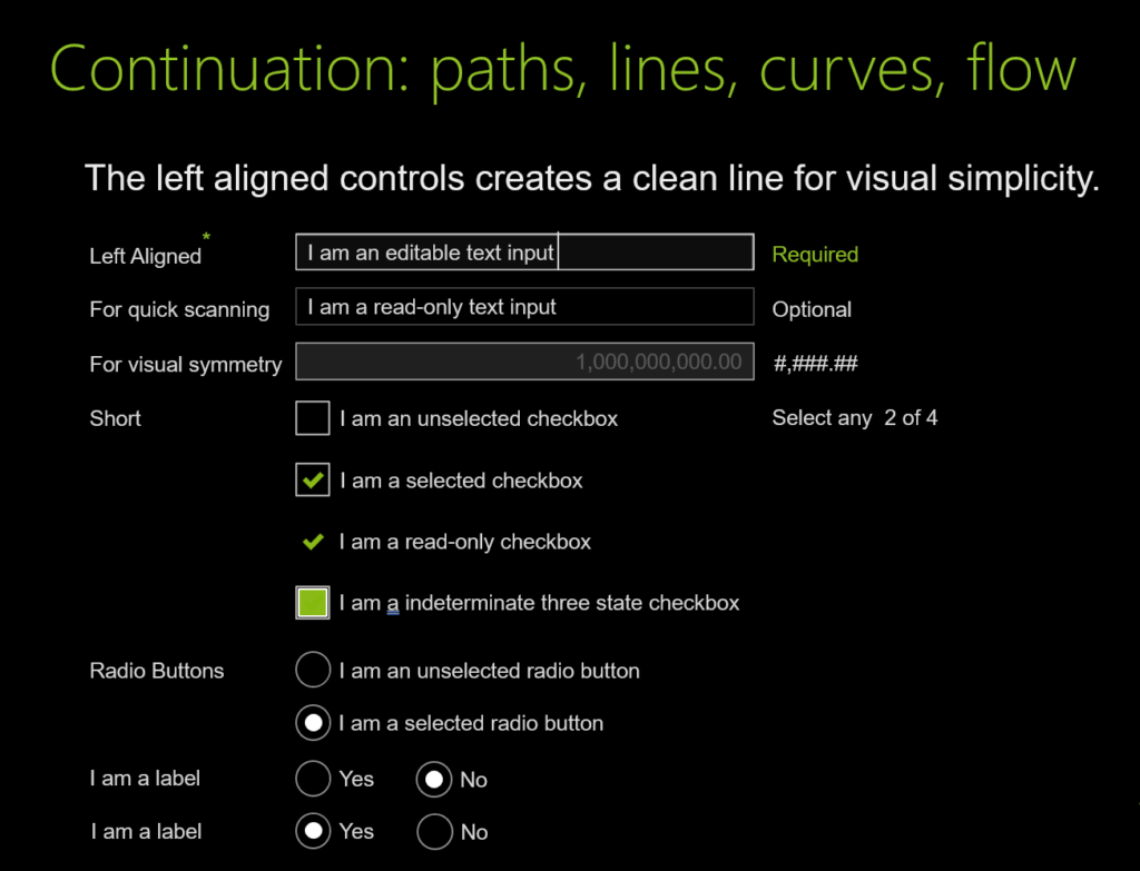
UI design and development example for Continuation: paths, lines, curves, flow

Prompting the reader to Look at the left side of the controls: What do you see?
Line placed on the left of the controls to show that The clean line is broken. The top highlight is 1 pixel wider and not all the checkboxes and radio buttons are on the line.
Controls are fixed and left aligned. The left aligned controls creates a clean line for visual simplicity.

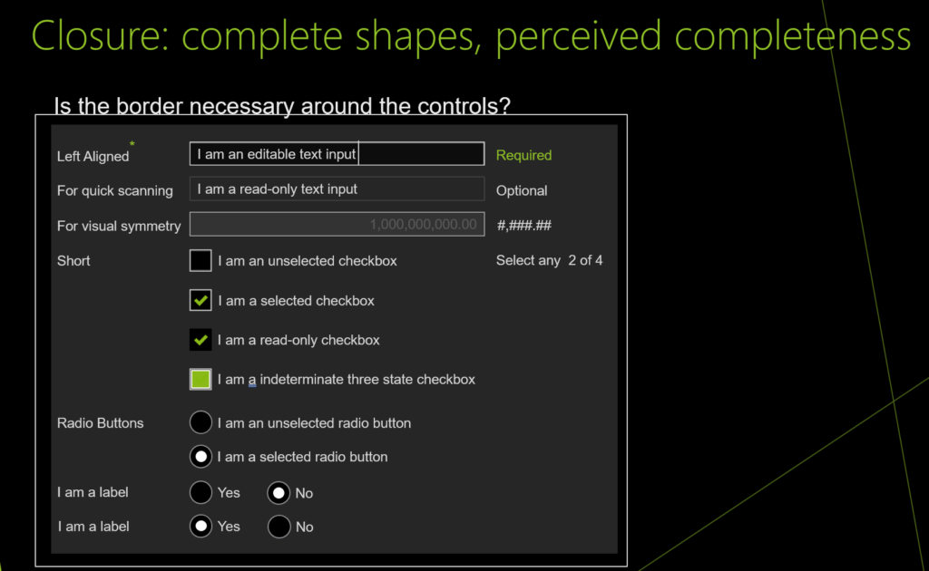
UI design and development example for Closure: complete shapes, perceived completeness

There are a set of input controls and labels that are evenly spaced and close together with a grey background and white box around it. Is the border necessary around the controls?
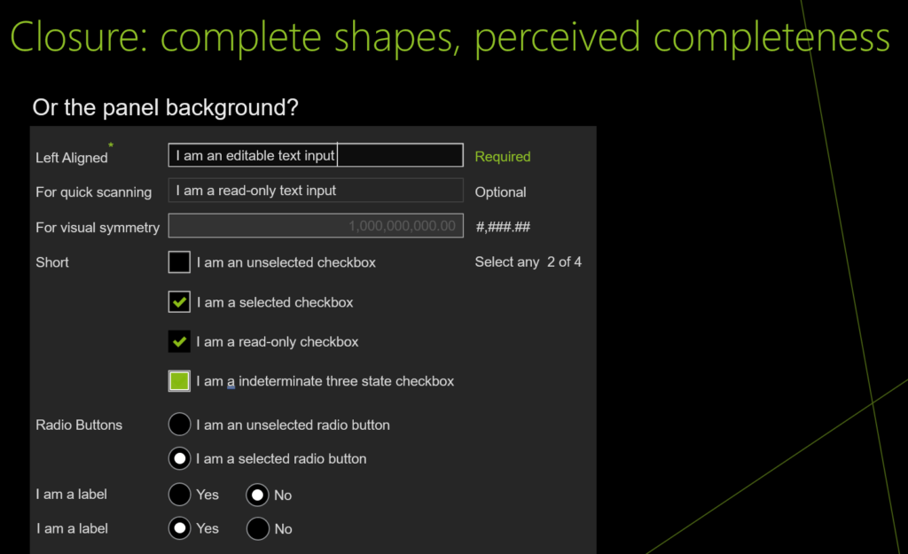
The border is removed and there is less visual noise. Do the grey panel background need to be there?
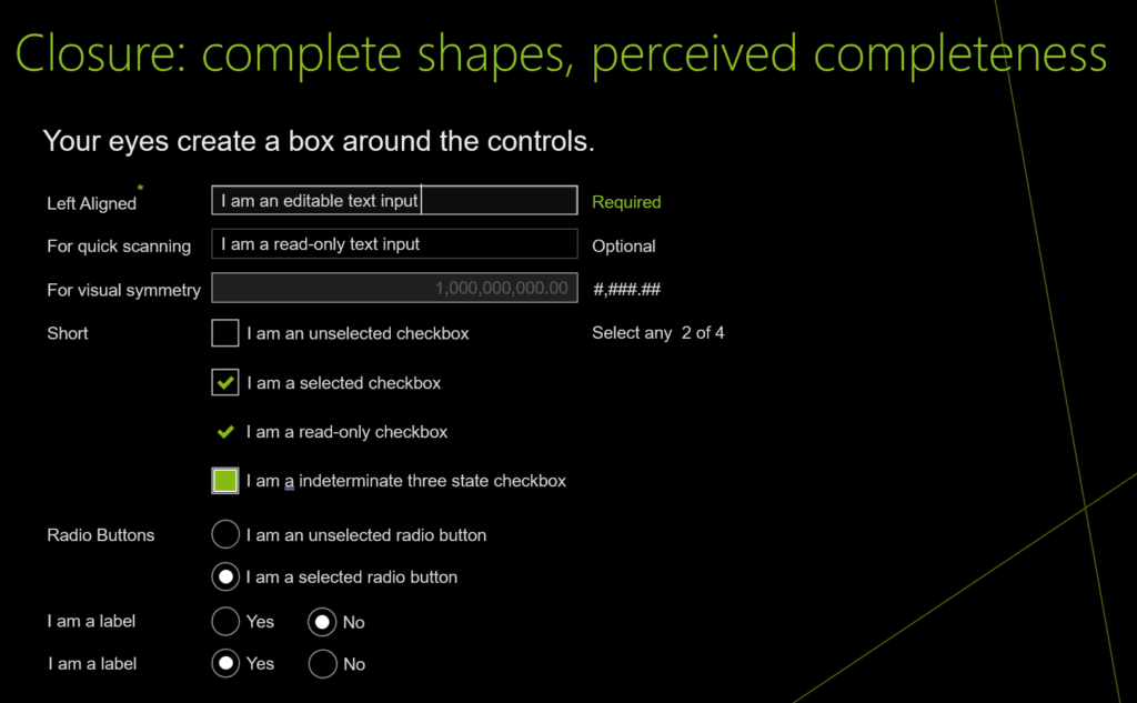
The border and background is removed and it still looks like a square. The mind fills in the lines around the set of controls.

UI design and development example for Proximity: proximity of objects create a perceived larger shape

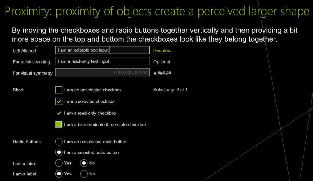
An image of the same controls and labels with similar vertical distances which makes them look like they belong together.
The same set of controls but there is less vertical space between the checkboxes and between the radio buttons as well as additional space above the checkboxes and radio buttons giving the stronger impression that they are grouped together.

UI design and development example for Figure/ground: visual separation of figures from backgrounds

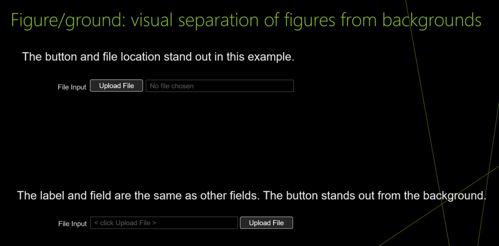
The image shows a label, a button with low contrast text and an input box with low contrast text right next to each other with no spaces.
Two examples where the button has higher contrast so it stands out from the background and it is easier to understand what needs to be done.

UI design and development example for Symmetry and order: balanced and complete

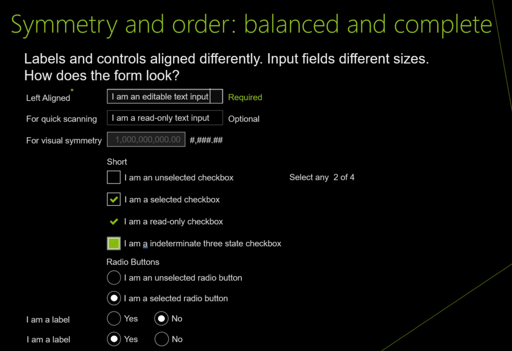
similar image of the labels and input fields from other examples. Labels and controls aligned differently. Input fields different sizes. The question is how does the form look?
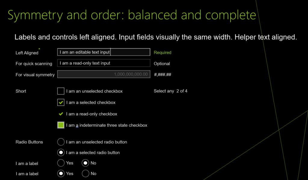
Image shows Labels and controls left aligned. Input fields visually the same width. Helper text aligned. It is easier to look at and to scan.

As you work on the UIs for your products, ponder the following:

  • For many developers the view is inside out. There are many objects to be placed on the screen and they need to function properly so the application works.
  • For many designers the view is outside in. There are many objects to be placed on the screen so that it makes in simpler for the user to get their tasks accomplished.

The following can help the designer and developer get on the same page

  • Similarity: shapes, color, size
  • Continuation: paths, lines, curves, flow
  • Closure: complete shapes, perceived completeness
  • Proximity: proximity of objects create a perceived larger shape
  • Figure/ground: visual separation of figures from backgrounds Symmetry and order: balanced and complete
Leave a comment

Your email address will not be published. Required fields are marked *