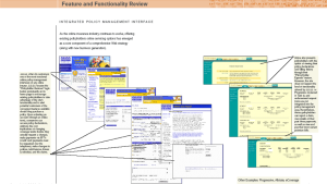
As part of the overall competitive analysis, my clients ask me to compare the competitors’ products and services to their own.
An organization typically has a list of competitive issues encountered during the sales process. In addition, there may be marketing and product checklists of feature by feature comparisons. Due to companies using design as a differentiator, clients are now seeking a competitive analysis of the user experience.
An effective way to start a competitive analysis of the user experience is to select the tasks for which the products compete head-to-head. For example, with online products, the research and sign up process can be compared to show first impressions imparted by each product.
- Take screenshots of each step in the task
- Lay out the screens so that the reader can walk through the screens step by step
- Lay out the competitors on the same page so that the comparison can easily be seen
- Edit the document to show the story for each task and add call-outs to highlight design differences and similarities
- At the end of the tasks, create a summary section to highlight key points of differentiation

Once you are done with the document, print it out, and post it on the wall. Being able to see the screenshots stretched out on the wall gives reviewers a better sense of the overall comparison between products.
“I have been up against tough competition all my life. I wouldn’t know how to get along without it.” -Walt Disney
Copyright 2015 Frictionless Design LLC

