SharePoint is difficult. It is hard to use, confusing to set up and inconsistent. Now that I am done telling you what you already know, let me walk you through an inconsistency.
Recently I was working at a client site. They asked me to post my documents on Microsoft’s SharePoint so that everyone in the company can have access to the files. After hours of looking through all of the webparts, apps and what not that they jam into SharePoint I did not feel that I got very far providing access to all the documentation.
I soon found that it was not only the gross functionality that was all over the place but also the overall visuals combined with the basic interactions. Here is a walk-through of one page only looking at the hover-over actions and visuals. There are very few things on the page that do the same thing.
Visual affordance is key to knowing what to do. Guess what is clickable and what you expect it to do.
Office365 logo:
- Cursor is a finger,
- tooltip and
- a footer URL
How about the other white on red text such as “Outlook”?
- Cursor is a finger and
- the background goes lighter.
And the toolbar changes to grey for the logged in user. It is a droplist.
- Cursor is a finger,
- tooltip,
- the foreground gets darker and
- the background gets lighter.
- Droplist does not open.
Oh so the other 2 buttons: gears and the help “?” act the same way, right?
- Cursor is a finger,
- tooltip,
- the foreground gets darker and
- nothing happens to the background.
- Share, Follow, Synch and Expand icon act the same way.
Why do they all get names and expand does not?
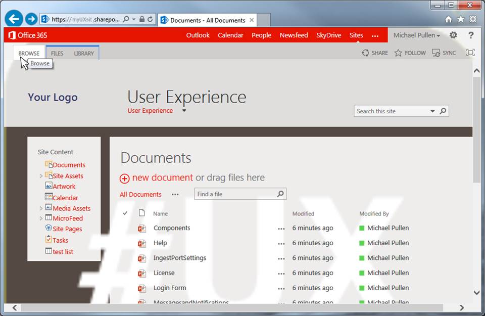
The Browse secondary tab:
- Browse.
- Cursor remains an arrow,
- tooltip and
- the background is lightened.
- No other visuals.
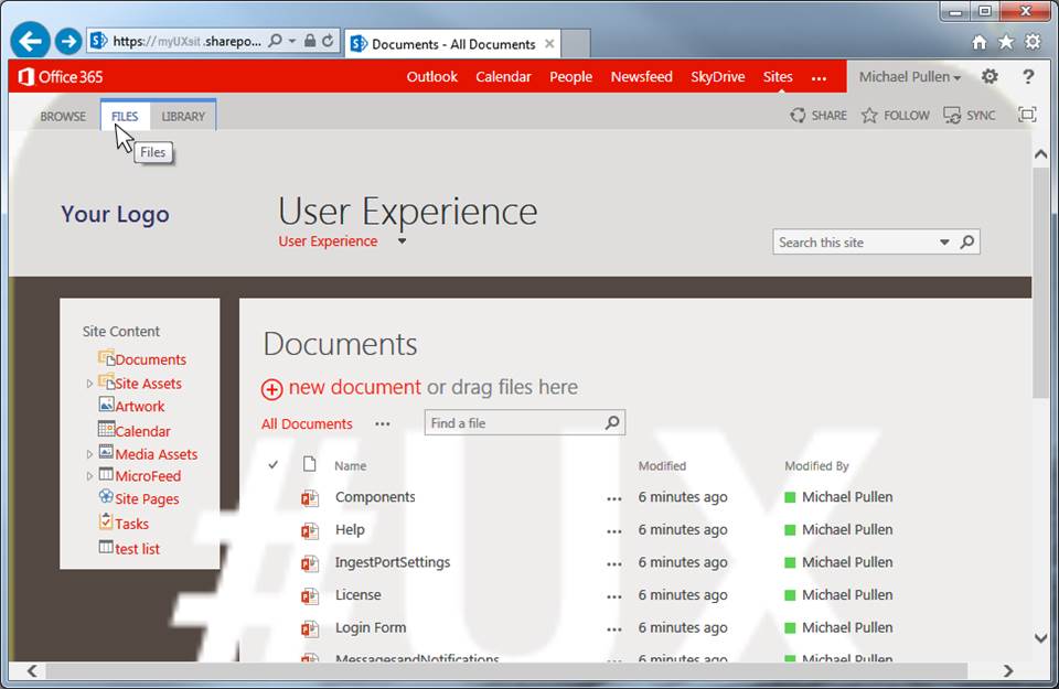
The secondary tabs: Files and Library.
- The resting state looks like a tab.
- Cursor remains an arrow,
- tooltip,
- the foreground turns blue and
- the background is lightened.
Site name – the big grey “User Experience”
- No visual change to the element.
- The cursor turns to a finger and
- the URL shows up at the bottom of the page.
The droplist “User Experience” under the site name – foreground is red
- Cursor turns to a finger,
- no visual change in text or background,
- tooltip appears,
- droplist automatically opens.
Search box
- Cursor changes to an insert icon,
- the border turns red,
- tooltip appears.
Left hand nav bar – bar title
- The cursor turns to a finger,
- the foreground changes from grey to red
- and the URL shows on the bottom of the page.
Left hand nav bar – item icon in the list
- Cursor turns to a finger
- and tooltip appears.
- No other visual indicator.
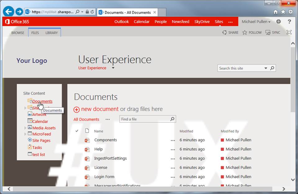
Left hand nav bar – item text in the list
- Cursor turns to a finger,
- tooltip appears,
- and the text gets underlined.
BTW: the icon and the link go to the page.
Left hand nav bar – expand triangle
- Only the cursor changes to a finger.
- No tooltip or other visual indicator.
BTW: the arrow does not navigate it only expands the tree
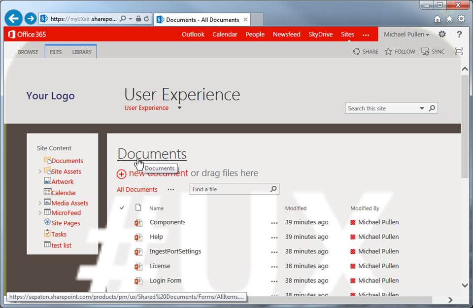
Site content – Documents title
- Cursor turns to the finger,
- tool tip
- and underline.
- No color changes.
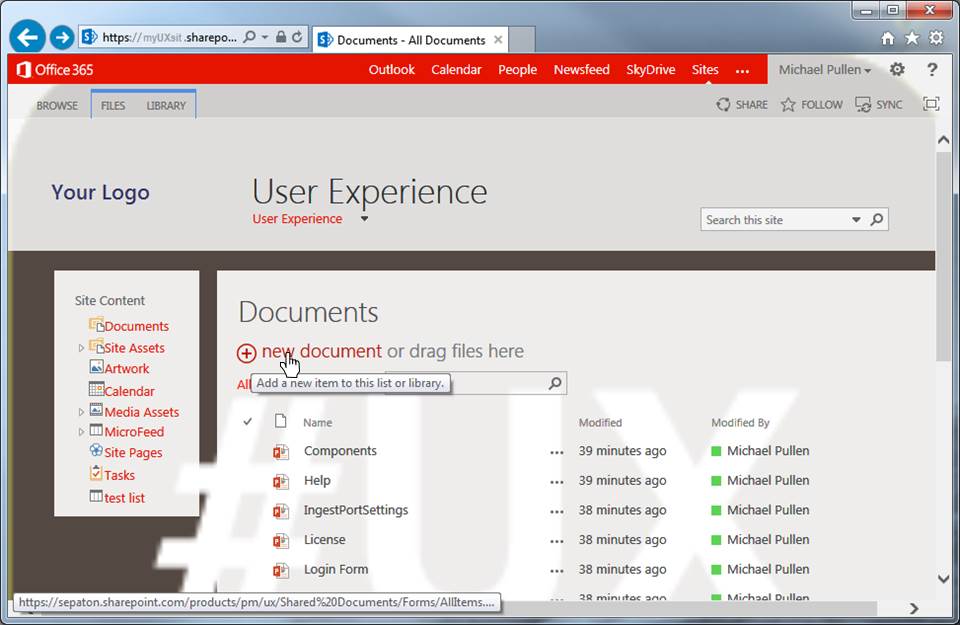
Add “+ new document”
- Cursor changes to a finger,
- tooltip,
- and font turns darker
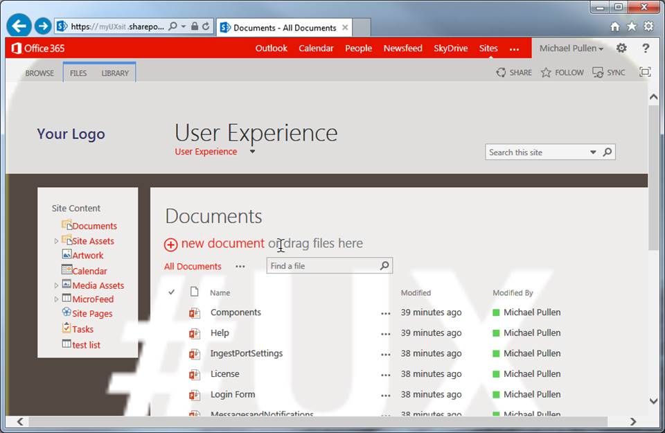
“or drag files here”
(which is just text and should not have an interaction)
- Cursor turns to the insert icon
All Documents and” …”
- Cursor changes to a finger
- and the footer shows the URL.
- No other visual change.
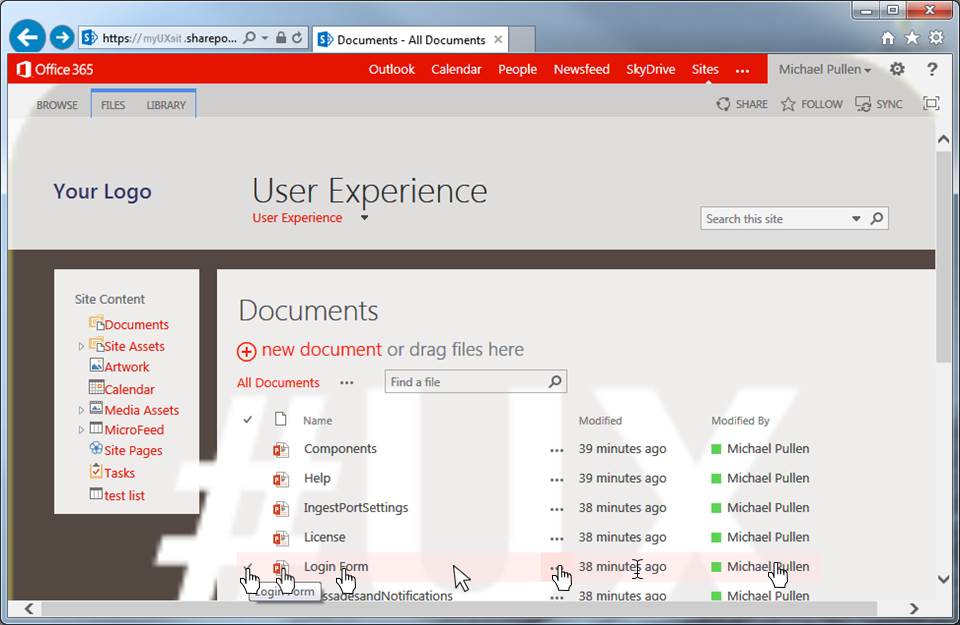
Table row hover
- Cursor turns to finger,
- Checkmark goes in front of the row,
- row background turns pink
Each column has a different result:
- checkmark: cursor turns to finger, tooltip
- icon: cursor turns to finger, tooltip 2 (different from above)
- Name: cursor turns to finger, no tooltip, URL at bottom of page
- Blank space in row: cursor turns back to arrow and no tooltip
- Ellipses “…”: cursor turns to finger, tooltip, URL at bottom of page
- Modified: cursor turns to insert icon, tooltip shows date/time
- Modified by: cursor turns to finger, pops up MS contact card
This is the case of many teams and many product managers deciding they need the feature and that they will fix the “minor” issues later. These all are minor issues but the whole experience is like stabbing yourself with a butter knife. Yes it is true that no one stab will kill you. But after being stabbed many times you are left a bloody pulp.
Clean these issues up. Making the visual affordance consistent will let the user know what to click on and what to expect.


