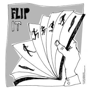
I work with complicated applications. Most of the screens have many moving parts. Describing the interactions and the flows to product owners and customers can be challenging. I use Microsoft’s PowerPoint to create a modern-day flip book.
Remember back to English class and doodling an animation in the bottom corner of the novel you were supposed to be reading? On each page I would draw a little guy walking along or riding a bike, going over a jump, and crashing into a million pieces.
Now I create similar “animations” using PowerPoint slides as individual pages. Showing the state changes to multiple parts of the screen for each interaction allows a product owner or customer to see what is going to happen. Each slide is a picture of the screen. Every slide is static. However, by clicking the down arrow or up arrow the viewer can walk through the changes. No actual animation is used to transition slides or move objects on the slides. The motion comes from the small changes done to the screens when viewed in sequence.
Steps to create a click-through:
- Create the base slide by copying or drawing your screen
- Copy the slide and paste it after the first one
- Alter the screen to show the first change (e.g. a hover over or click)
- Create an arrow that is big and bright to act as the cursor and focal point
- Now you can click the slides back and forth to see the transition
- Do this multiple times for each change in the screen
- Add enough slides to bring the user through the whole set of changes that may occur
- A slide deck can end up with 50 to 100 slides depending on the complexity of what you are communicating.
In addition to using the click-throughs to communicate to the product owner and users, walking through the steps in this manner will help you as the designer visualize the interaction and flow.
Copyright 2015 Frictionless Design LLC

